Festival TAKA
Services
Social media communication
Video & motion design
Brand identity
Creative direction
Client
Garataka
Year
2024, 2026
Credits
Dārta Apsīte
Kristiāna Marija Sproģe
Lauma Studena
Eduards Balodis
AWARDS
Gold
LADC ADWARDS XVII 2025
Nominee
LATVIAN DESIGN AWARD 2025
Info
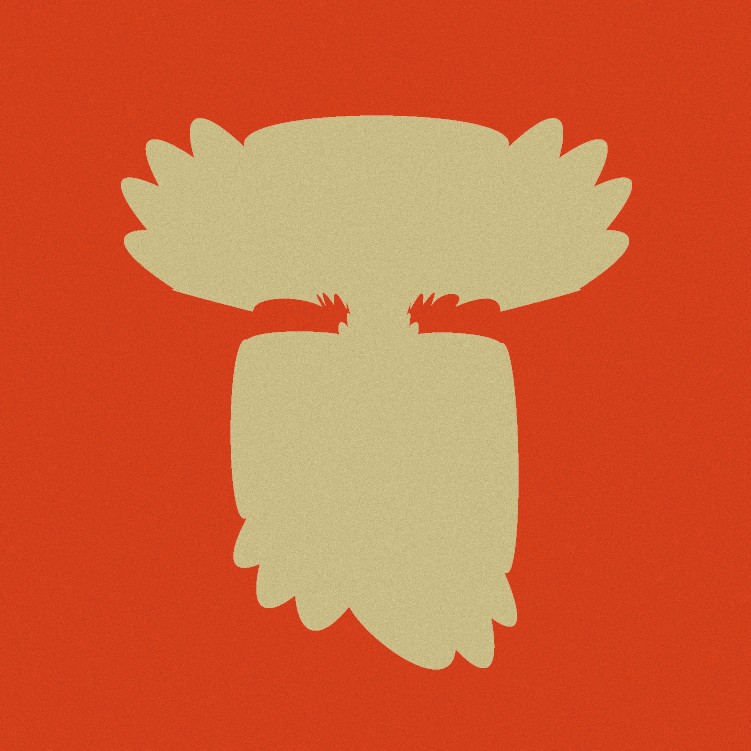
The visual identity of the festival TAKA (“PATH”) was created for the first family folklore festival in the urban environment of Riga.
The main design goal of TAKA is to visually integrate folklore traditions and their authenticity into the cityscape in a contemporary form. This unique blend with the modern creates a visually compelling, expressive, and vibrant dialogue between the traditional and the contemporary.
The inspiration for the typeface design was drawn from the shapes, shadows, and silhouettes of plants found along forest trails — from the sounds, rustling, and movements they create — allowing the letterforms themselves to become inhabitants of the trail.